
Do you know what statement your gate color is making? Or, what color you should paint your gate to make it communicate what you want?
I had always reckoned that selecting a gate color had more to do with coordinating it with the house, fence or other structures. While I don’t believe that is necessarily wrong now, I have been reading a little more about the emotions color conjures and think it might be worth considering as you ponder your choices.
I’m not a color guru. I’m basing my suggestions on a color chart created by Carey Jolliffe Graphic Arts that I found in this article by Melanie Pinola, “Pick the Right Color for Design or Decorating with This Color Psychology Chart.”
Be sure to let me know if you agree, disagree or have other thoughts and suggestions in the comments. Let’s start with our most popular gate color …
BLACK
Our custom gate clients love black. I’m sure that is because it stands for power, strength, security and protection and those are the primary reasons to have a gate. Also, based on other terms used to describe black, I would say those that choose a black gate want to portray elegance and sophistication.

Believe it or not, black can be a challenging color to paint depending on your gate design. We discuss a black paint “fail” and fixing it in this article. Maybe reading about our mistakes will be helpful.
On gates, matte or satin black looks best because that color absorbs the light and appears smoother and cleaner. On the other hand, if a glossy black is selected, the sheen can catch the light in a way that distorts. We never recommend glossy black on our gates.
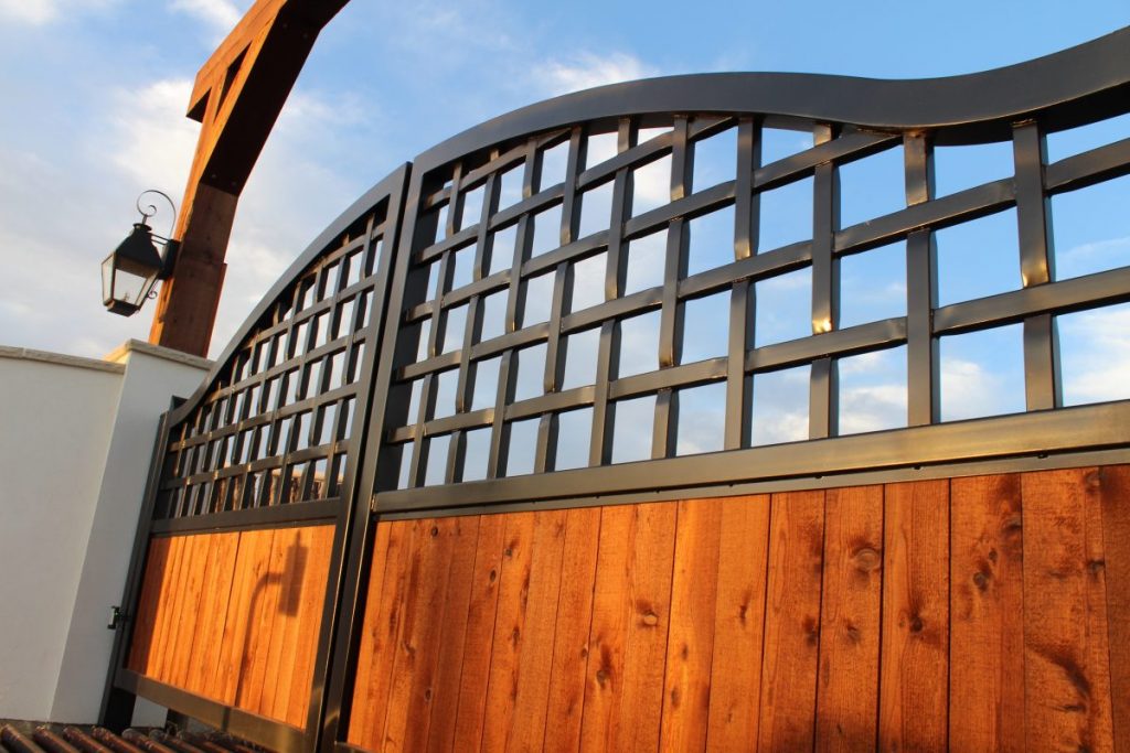
Satin black shows off the braided metal details
Collars look symmetrical with satin black

Matte black keeps the angles on this gate looking crisp and straight
BROWN
Second in popularity to black for gate color with our clientele, is a brown or rust finish. People selecting this color want something down to earth. Color psychology would say they are communicating friendliness, warmth and reliability.

Our metal gate clients have been very happy with our force-rusted finish. It hastens rusting and gives the gate a very natural look, which is a popular modern trend. You can literally watch the rust appear in the matter of seconds. It makes the gate look like it has been there for a long time already.

Force-rusting seconds after application

Finished force-rusted gate
FAUX-WOOD-GRAIN PAINT
As a side note to the “brown” category, we started faux-wood-grain painting gates to give our clients even more options in 2018. These are mostly in the brown family. Check out this article where we elaborate about gate finishing options. Here is an example of some aluminum barn doors with faux-wood-grain painted aluminum inserts. They will last longer than wood in the Texas heat.

Faux-wood-grain Painted Barn Doors
GRAY
The terms I found to describe gray are steadfast, enduring, responsible and accountable. Gray sounds like a close cousin to black when it comes to communicating safety and security. And, it is also considered sophisticated and classy.
Gray is a solid choice for gates because it doesn’t seem to be as tricky when it comes to using either a matte or a glossy finish. I’d put the gate we designed and built for Karen Bougnou of Weatherford, Texas in the gray family. I believe she called the paint color “burnished slate”.
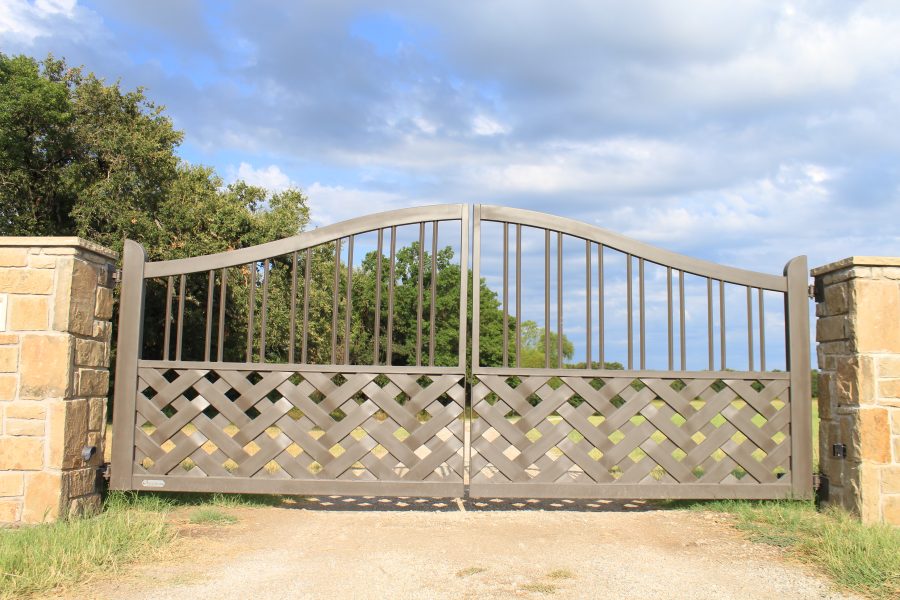
Burnished slate color is safe, secure and sophisticated. S-cubed!
SILVER
In the world of colors, silver is quite different from gray. It is more glamorous, sleek, stylish, modern and graceful.

Adding the silver-colored monogram to this gate added some grace and glamour, don’t you think?

Sealed and polished aluminum monogram
Bare steel is a trendy, but we don’t suggest it for gates because they live outdoors and you will have a constant battle with rust even if you seal them. However, maybe a little rust is what you are going for?

Metal steer skull before mounting and painting
GOLD
I’ll mention gold since I’ve discussed silver, but it is a rare choice for gates.
Typically, I’ve only seen metallic gold used on are very, VERY ornate gates. The kind that make me think royalty might live there. But, if you have a gold gate and this assessment doesn’t fit, please correct me. Emotional descriptors of gold are rich, luxurious, opulent, expensive, valuable and prestigious.
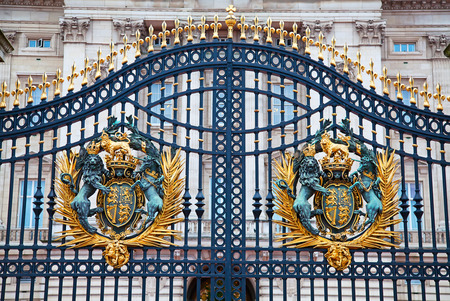
Gate of Buckingham Palace, London on December 23, 2014
RED
Red communicates excitement and energy. It is the universal color for love and passion. Fellas never go wrong giving red roses, right? On the flip side, red is also used to signify danger.
I know there could be many other reasons to have a red gate, but based on color psychology, you could be conveying two completely different ideas.

Red Ranch Driveway Gate
GREEN
I almost left off green on my first draft for some reason. We have done a couple of simple green gates. Green communicates a connection to the environment as well as growth, health, harmony and new beginnings. It makes me think of Spring.

Green Ranch Gate
WHITE
Pure and pristine white is a common color for gates, but we have not done many. White is associated with goodness and innocence. I would like to hear your thoughts, but I’m thinking white might be more popular on wooden gates than metal.


White Ranch Gate
My list is not comprehensive. If you have or have seen another metal gate color you love, please send me pictures and let’s discuss it.
CONCLUSION
No matter what color you go with, it can be tricky to make sure your gate stays that color. Do not go economical when selecting the paint! We use a very high-quality paint that holds up over time. It is a two-part, oil-based, industrial-strength paint that is not cheap, but worth it.
Please let me know in the comments what color your gate is and if you think the psychology of color should apply to your gate color. If you don’t have a gate, but dream of one, what color would it be and why?
Need more help? We’ve got a comprehensive checklist for designing and building your home or ranch driveway gate.

Amazing concept of selecting form,colour and style . How about blue gates ?
BLUE gates! That would be so fun. We’ve not done blue and I can’t say I’ve seen them. Have you? Send pics!! Anyone else seen them?
What do you recommend, matte or glossy finish?
That is a preference. If you are going with black, we really like a matte or satin finish. Glossy highlights and distorts slight imperfections. And, we just really like the look of a matte finish. Thanks for reading this article. Let us know if you have any more questions or when you are ready for a new gate!